Genentech Gather.
An online platform that connects breast cancer patients with local services and events.
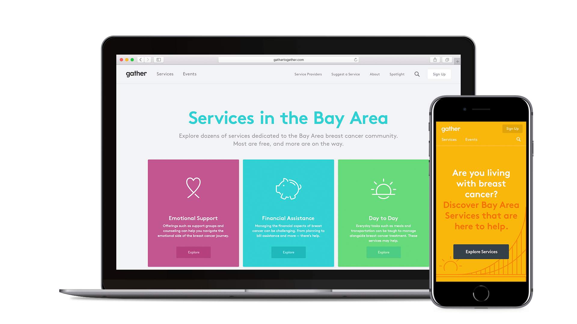
Genentech, a long-time partner in healthcare, has dedicated itself to providing support to patients and families within the breast cancer community. How can a new platform help people connect online and discover services and events in the Bay Area?
Website Design & Illustration • Designer @ Odopod • Fall 2015
Curated services and events
The Genentech Gather website provides a place for patients and families to connect and find support for diagnosis, treatment, and beyond. Curated collections and topics make it easy to discover helpful services, and local events allow patients, families, and providers connect outside of the online community.
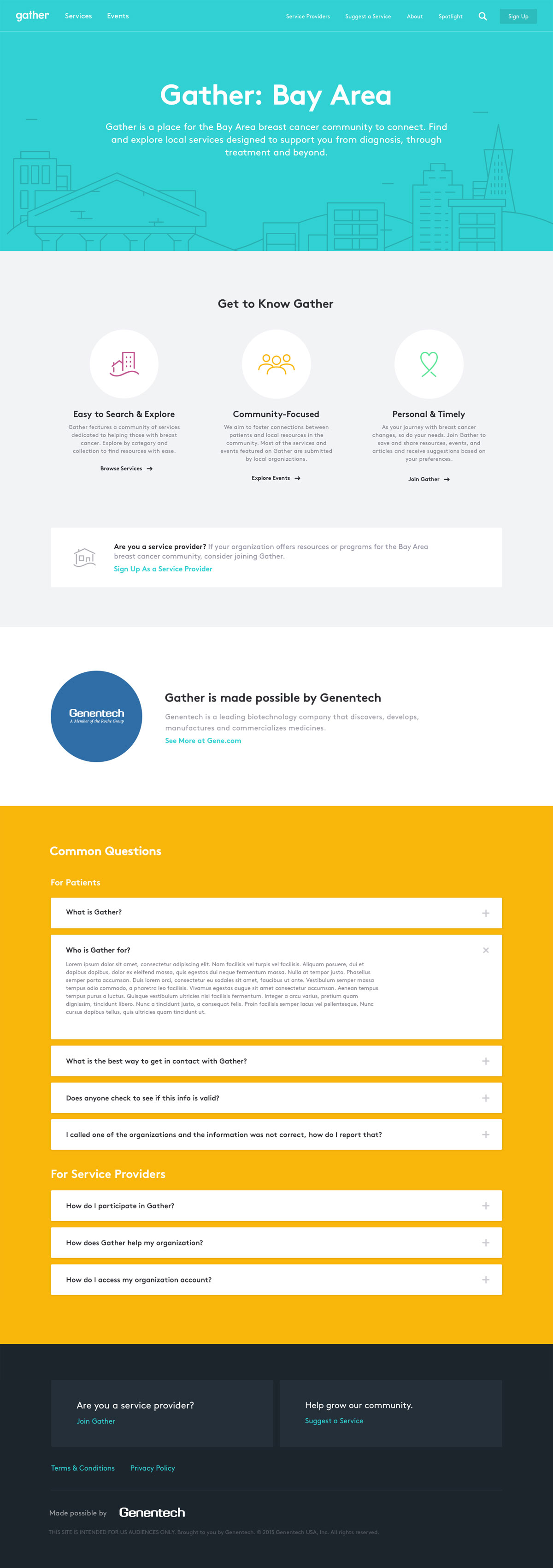
Creating a friendly and approachable look
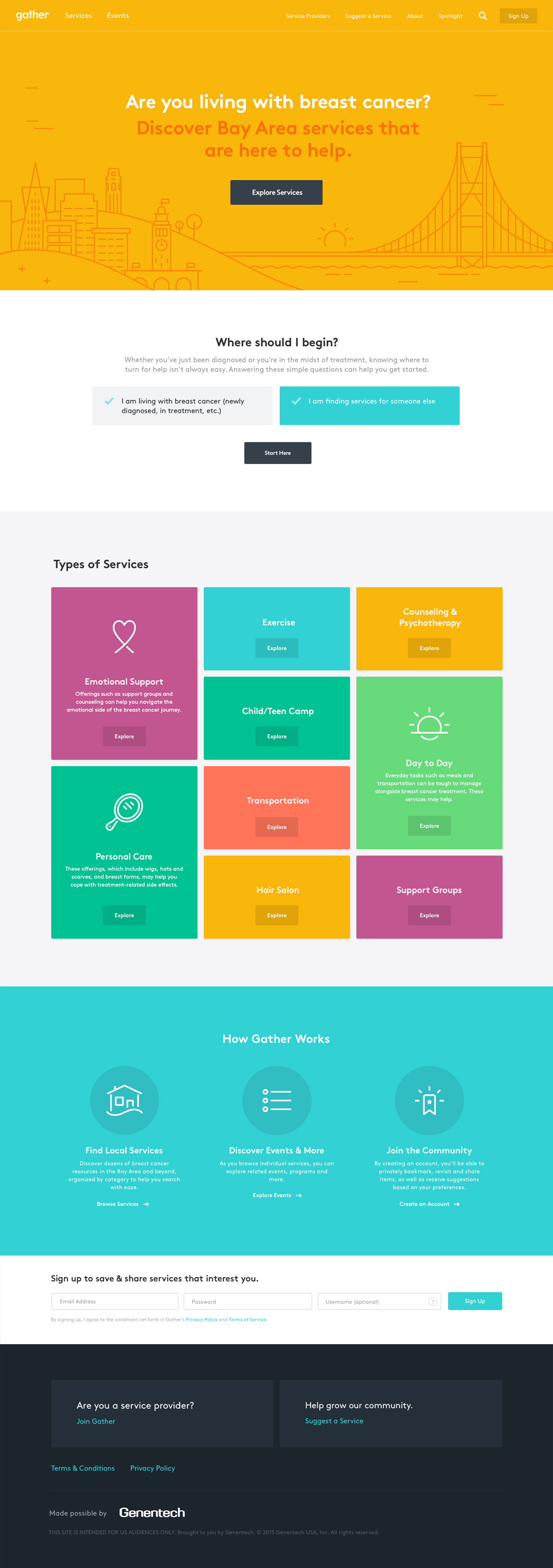
When exploring directions, we realized that photography was going to be difficult for Genentech to capture. We decided to instead let color and illustrations take the spotlight.
I designed a series of icons that paired well with the rounded look of Brown Pro, our chosen typeface. Placed alongside the bright variety of colors, these icons helped to capture the friendly look we desired for the site.
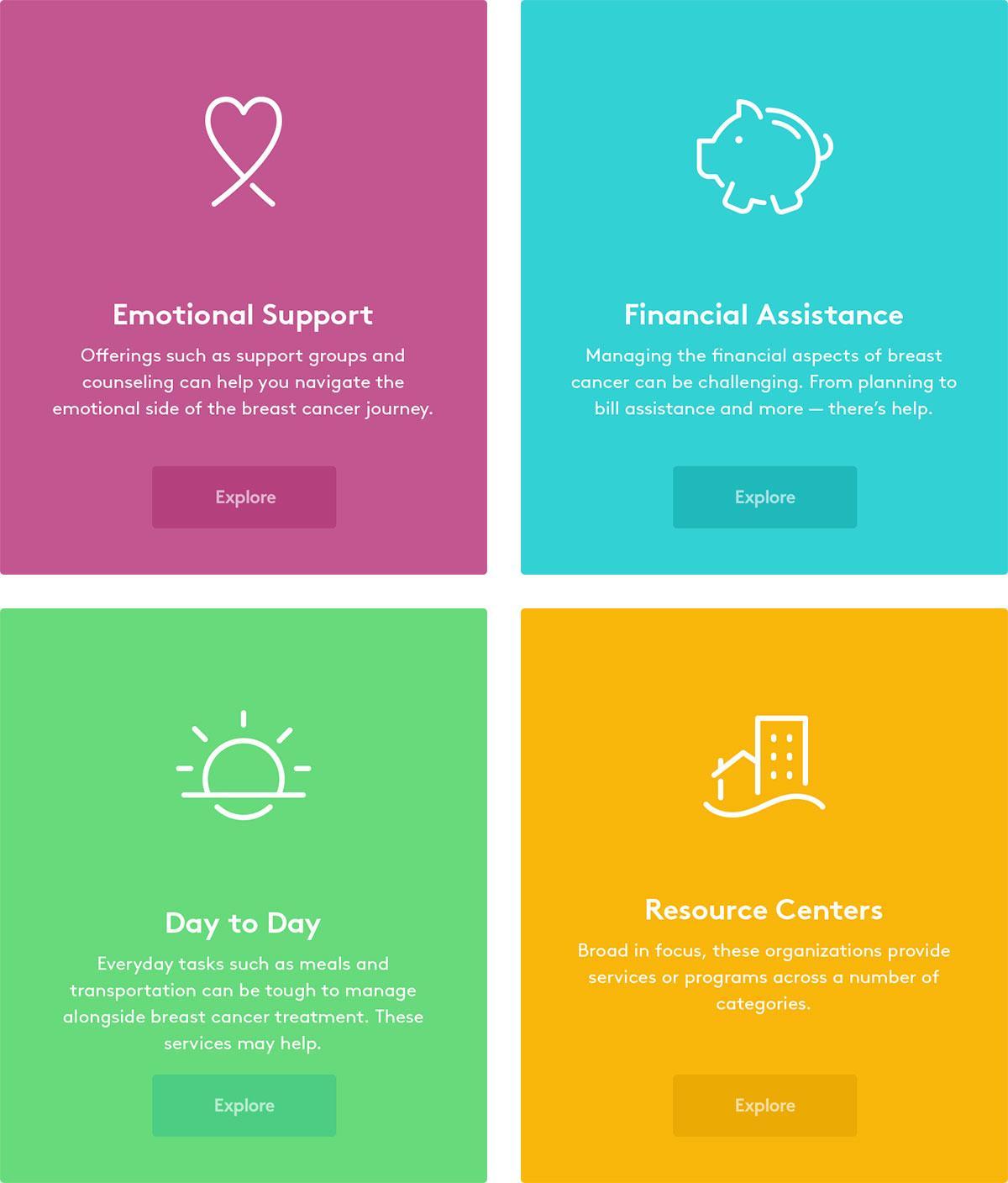
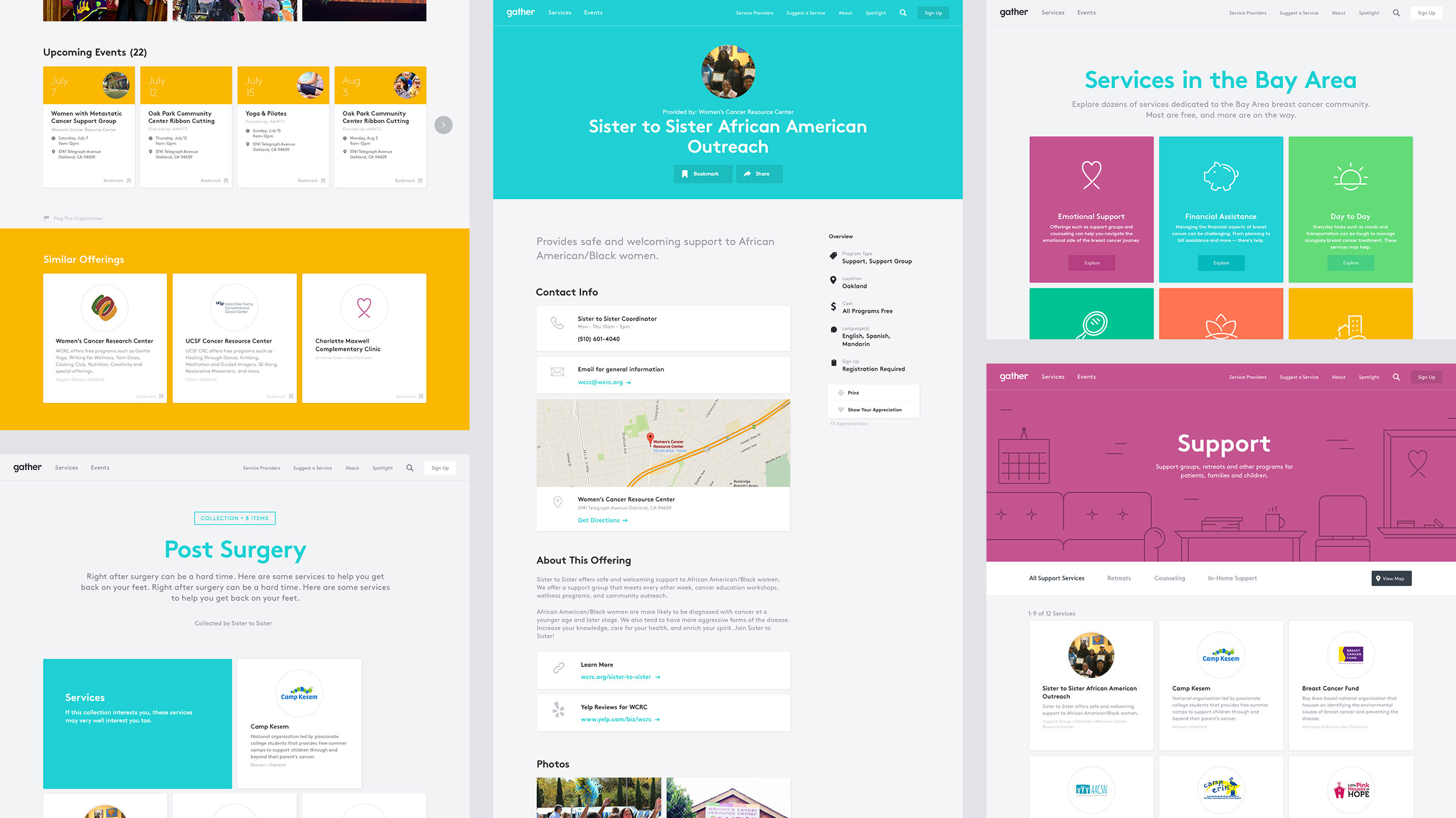
Illustrations crafted for support
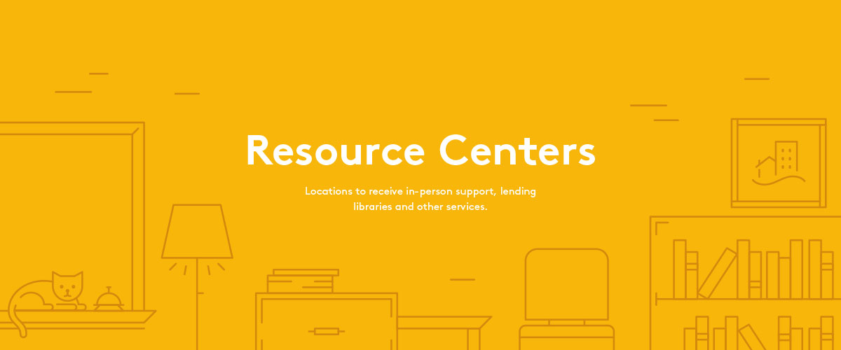
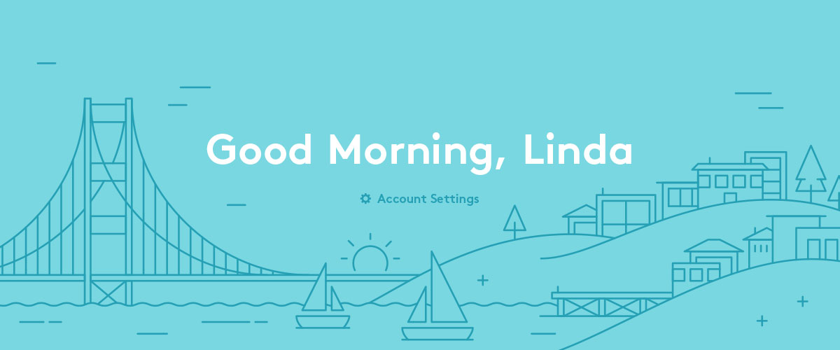
I created illustrations to represent various service categories and Bay Area locations. These illustrations compliment the style of the website and add interesting moments throughout the experience. As Gather expanded to other cities across the US, we created even more illustrations based on this style.
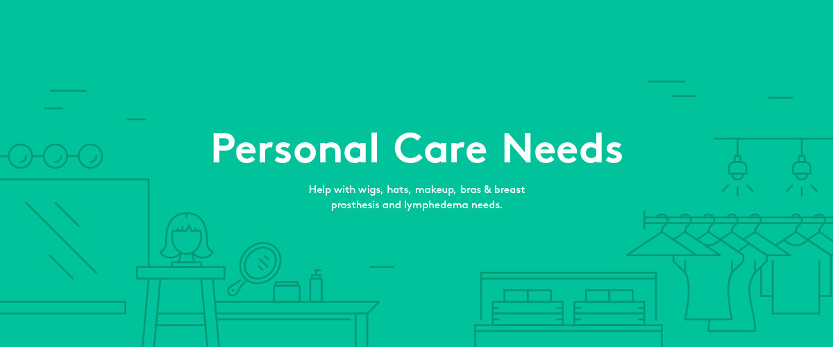

Quickly finding services
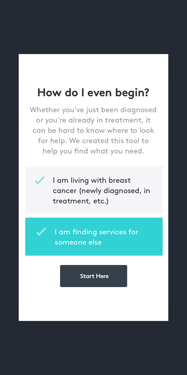
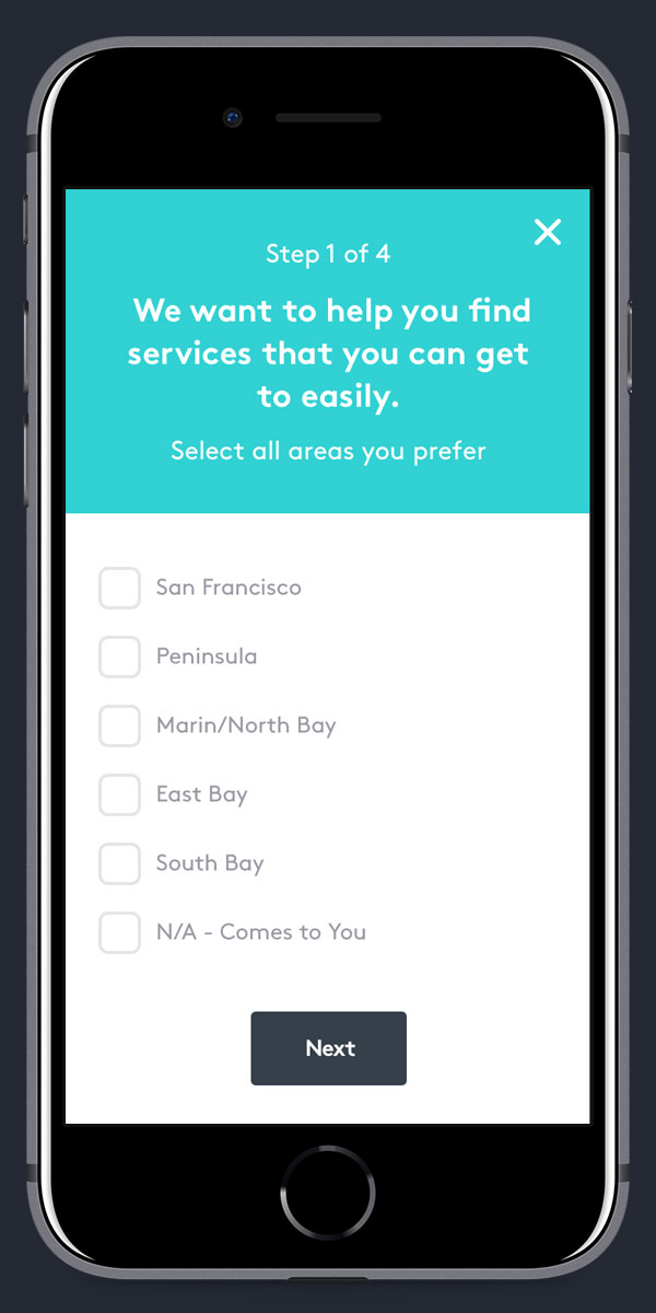
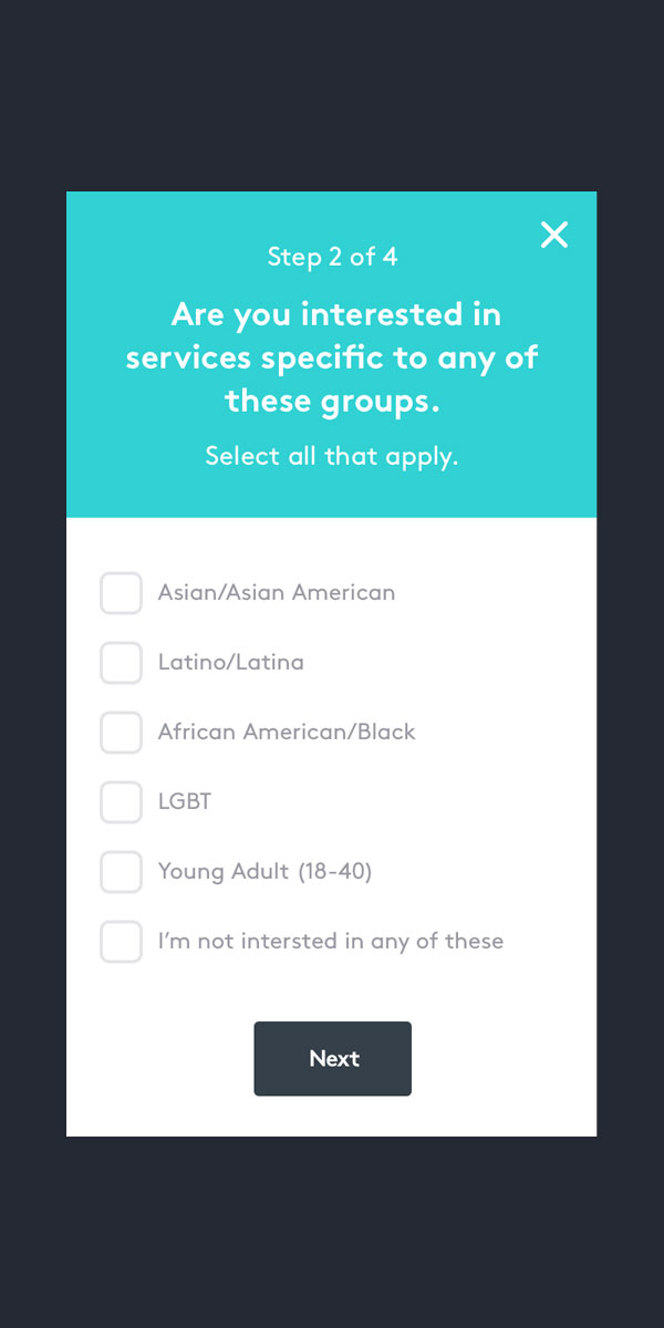
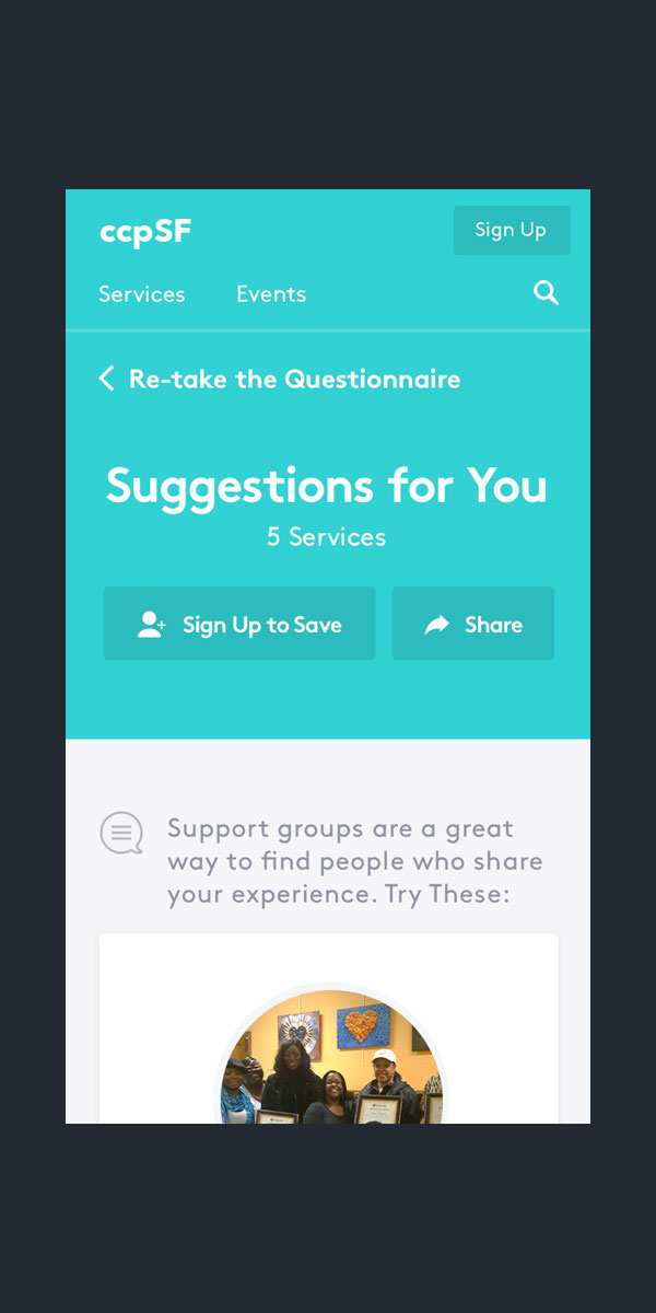
On the homepage, users can take a short questionnare to quickly find suggestions curated for them. This interaction is a friendly way to introduce new users to the services available on the Gather site.
Tools for both patients and providers
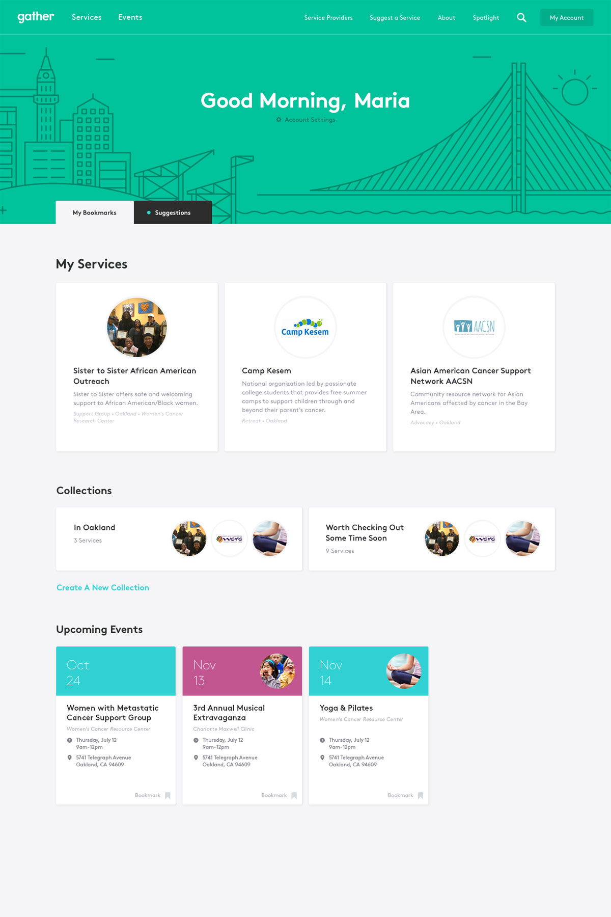
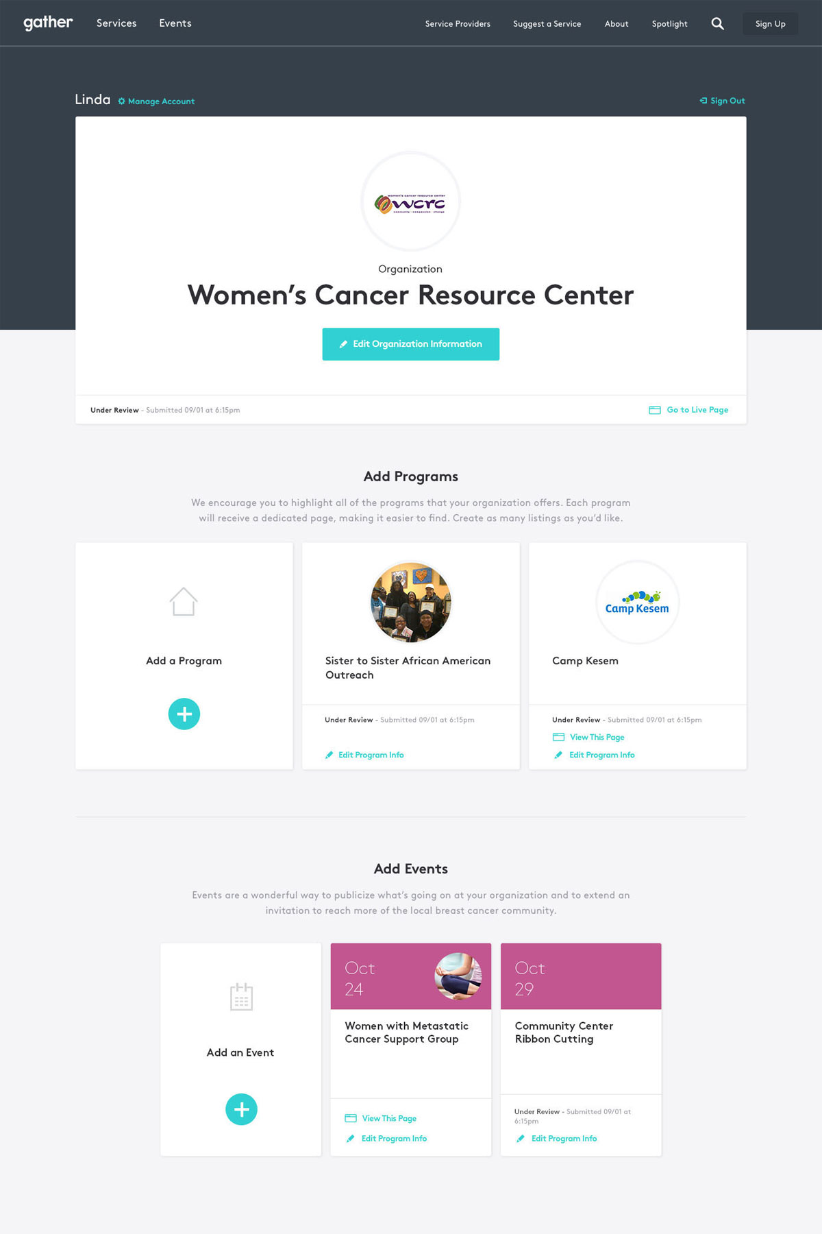
A user dashboard was created as a home for saved services, collections, and events. Suggestions can also be found here and quickly added into the user’s bookmarks. Providers have access to a similar dashboard that instead has controls for managing various programs and events.
Say hello.
Interested in collaborating or want to talk about red pandas and typography? Shoot me an email.
