TuneIn Rebrand.
Developing a fresh look for a brand that connects users with the audio they love.
TuneIn delivers a universe of live sports, music, news, and podcasts from all around the world through one incredible listening experience. How can a new identity help this brand reach its audience across a wide range of touchpoints?
Rebrand & Web Design • Art Director @ TuneIn • Spring 2018 • tunein.com
New Logo
Previous Logo
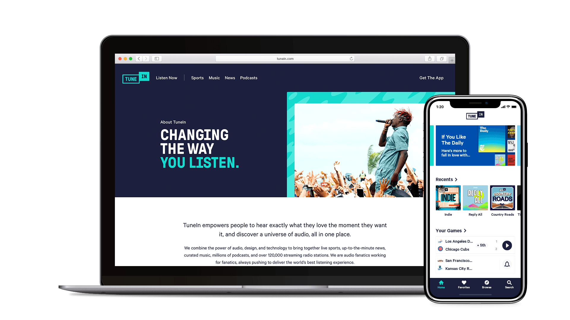
A new look for a new logo
When I joined the design team at TuneIn, a new logo had just been finished. It became my responsibility to explore an accompanying visual language that conveys the company's immersive and transformative goals.


Establishing a bold style
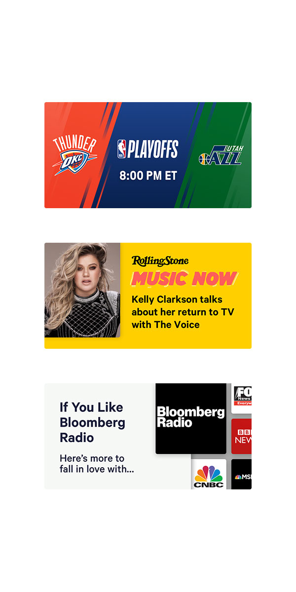
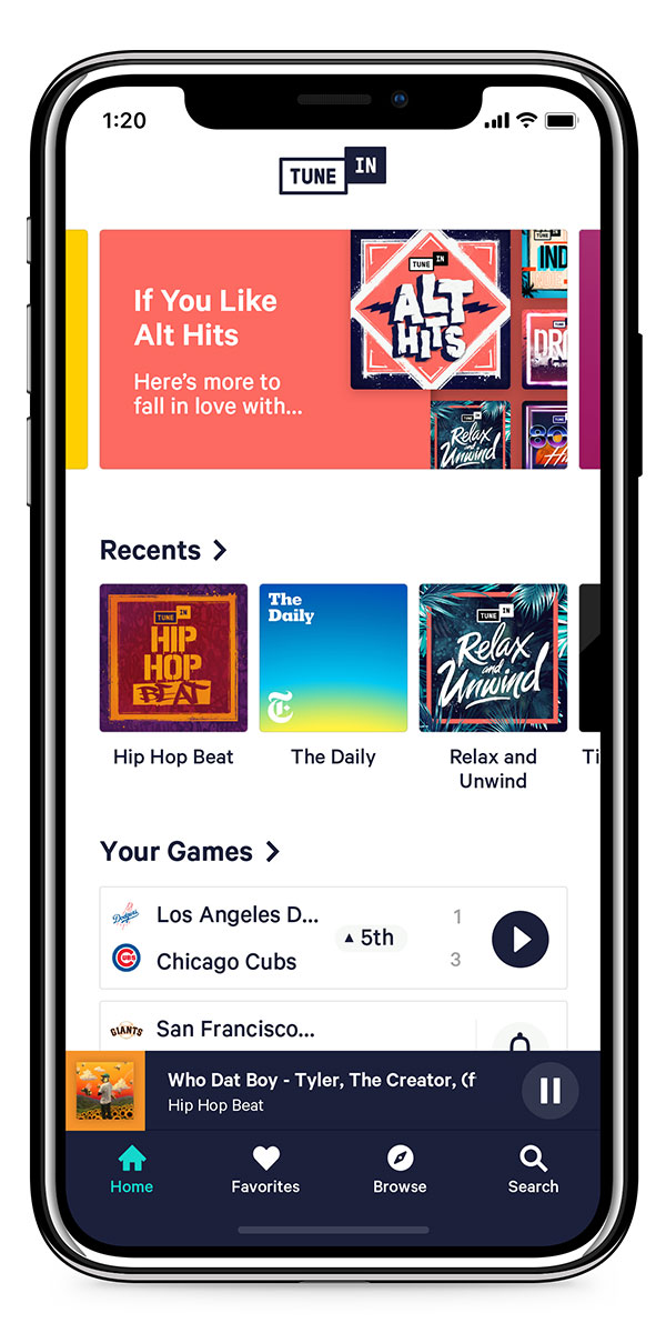
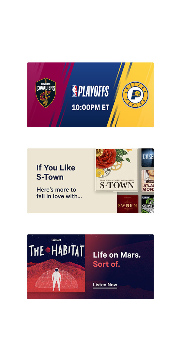
The TuneIn logo called for a new look that shared it's bold personality and offset structure. I lead the design team in exploring styles across a variety of touchpoints including in-app banners and social media.
A common challenge was finding a way to feature stations and podcasts without losing the TuneIn brand. We used asymmetric layouts as a foundation for the content's style which helped to keep a connection while establishing an interesting new direction.
Telling the TuneIn story
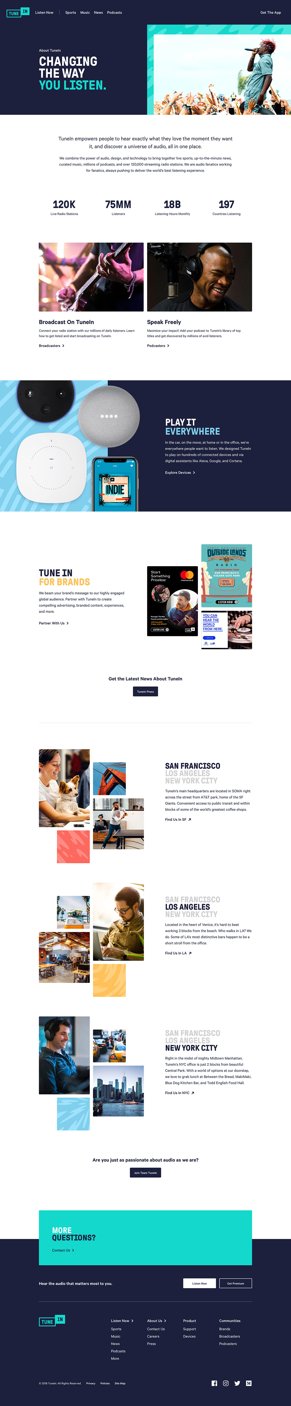
The website became an important piece of the rebrand as it was here that the TuneIn story would be told. We decided to lead the conversation by highlighting the wide selection of content available. Throughout the landing page, each section is paired with relevant stations and podcasts that showcase the breadth of content.
With the goal of bringing users into the web application, each moment provides an access point for the listening experience. Whether in the form of a featured station or a highlighted category, the user has many ways to quickly discover something they love.

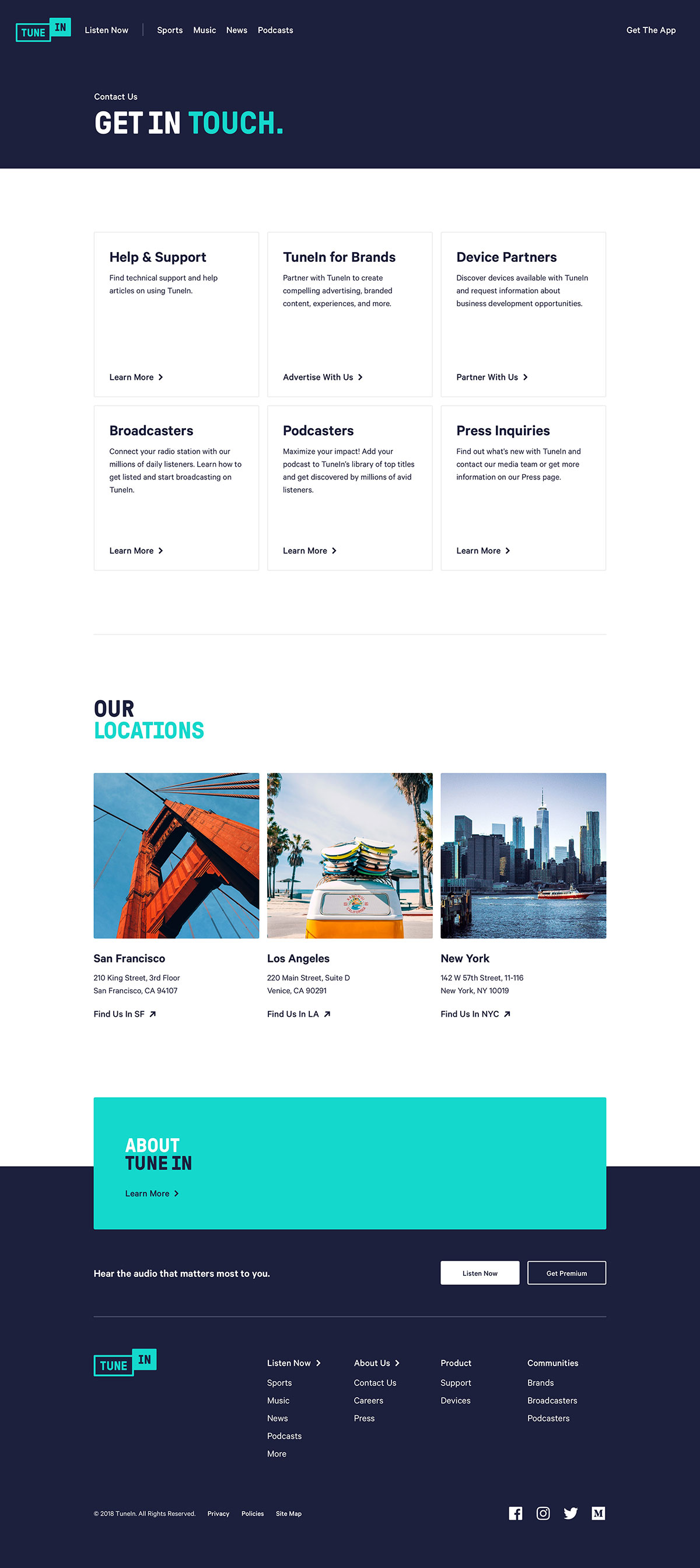
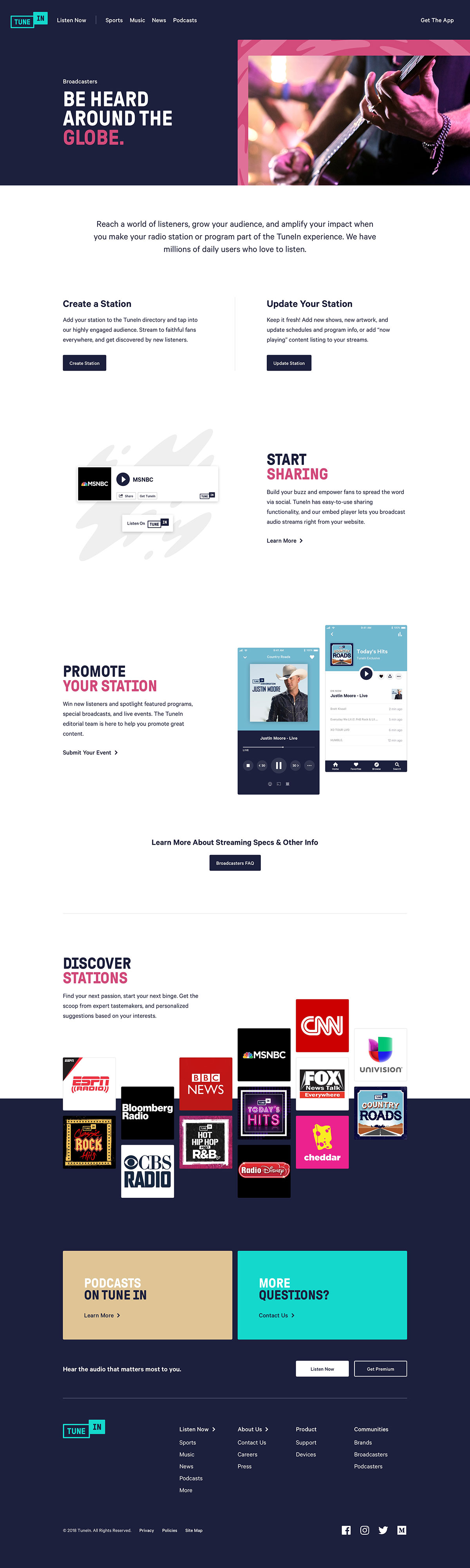
I also designed pages to highlight TuneIn's advertising and broadcasting abilities as well as useful information such as careers and contact. Working alongside a strategist, I interviewed various teams across the company to discover the elements needed to tell their stories. Information we gathered like advertising's offerings and the company's values helped me begin to outline structures for each of the various pages.
The offset layouts and bold styles were also used as I designed these additional pages. In these instances, the brand language is shown more since featured content isn't the focus. Large sections of ink, white, and pops of color throughout the website are reminiscent of the look and feel of the audio app.
To improve the a user's experience when reaching a dead end, I designed a new 404 page. Using carefully picked language, the new page highlights TuneIn's listening offerings as well as the breadth of content available. The search bar and suggested stations allow the user to continue exploring without returning to the home page. As a final touch, I animated a flickering "On Air" sign that shows the user they've reached a missing page.
Take a stroll through the site
Say hello.
Interested in collaborating or want to talk about red pandas and typography? Shoot me an email.